Corporate Design
Wordmark

Size, position and distance from the edge
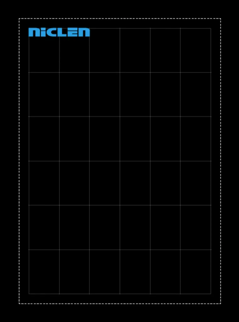
The position of the wordmark depends on the medium and layout used. Where possible, it should be placed and aligned based on the grid. The size can also be derived from the grid. The wordmark must not be scaled unevenly in width and height and must not be placed directly at the edge.
1 Standard wordmark
– Width across two columns of the grid
– Positioned at the top left edge of the grid
– Safe distance from the page margin
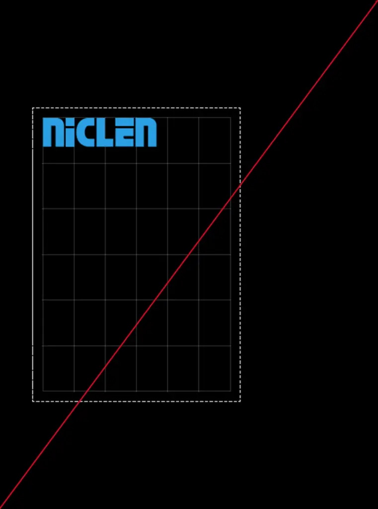
Please don’t do that
× The wordmark is not aligned with the grid.
× … is positioned directly at the edge.
× … its size is not derived from the grid.
× … is distorted.
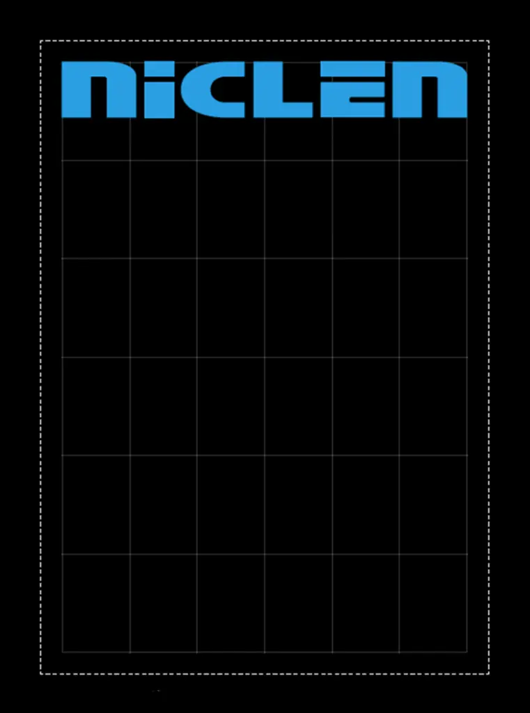
2 Large wordmark
– Width across entire grid
– Positioned at top edge of grid
– Safe distance from page edge
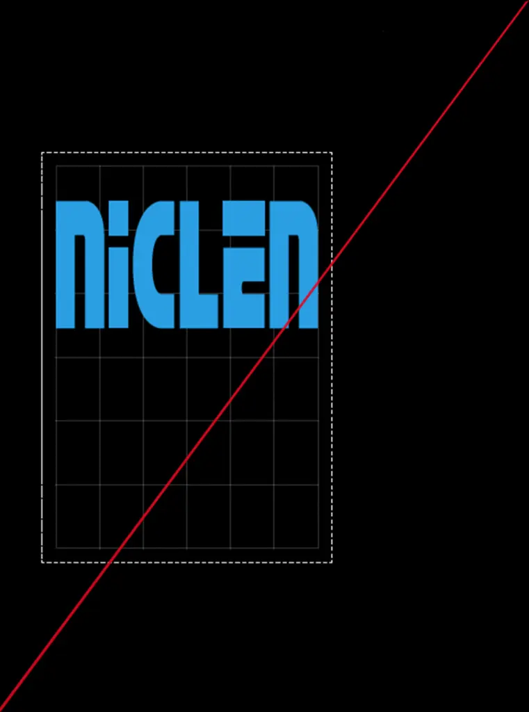
Please don’t do that
× The wordmark is not aligned with the grid.
× … is positioned directly at the edge.
× … its size is not derived from the grid.
× … is distorted.
3 Favicon
The reduced form of the wordmark is the template for the design element.
It is also used as a favicon, i.e. the browser logo for the NicLen website. As favicons are very small, they should not contain too many details so that they are always clear and easily recognisable. The ‘n’ is perfect for this.
Colourfulness and background
The wordmark may only be displayed in the colours of the colour scheme (see below). In addition, the background must contrast well with the colour of the wordmark. Images may be placed behind the word mark if they do not impair its legibility.
Wordmark in cyan
Cyan offers a strong contrast to both
white and black backgrounds.
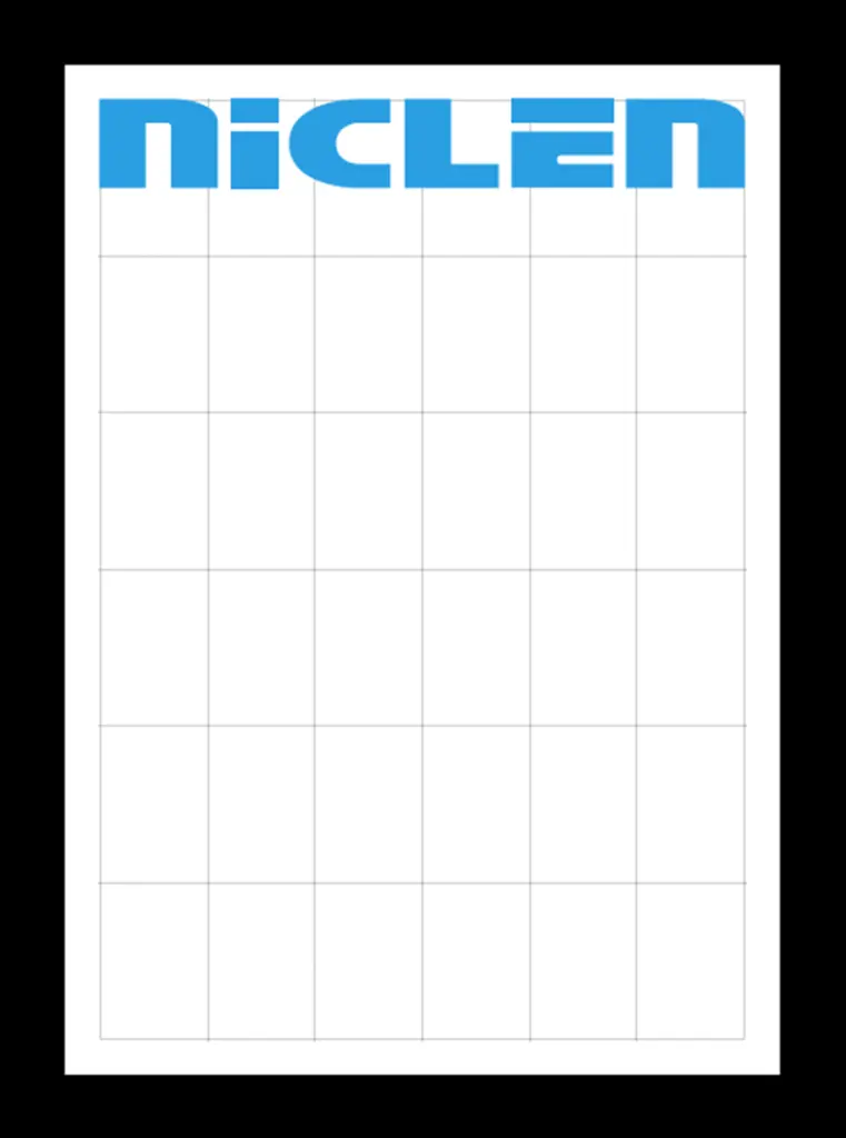
Example in DIN format
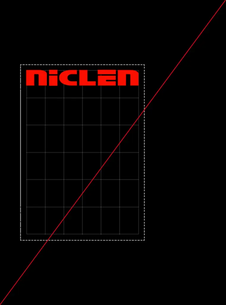
Please don’t do that
× The colour of the wordmark has been changed
Word mark on a background image
White as the fill colour of the wordmark for the greatest contrast to the background image. Always
choose the greatest contrast from the colour scheme to the background image.
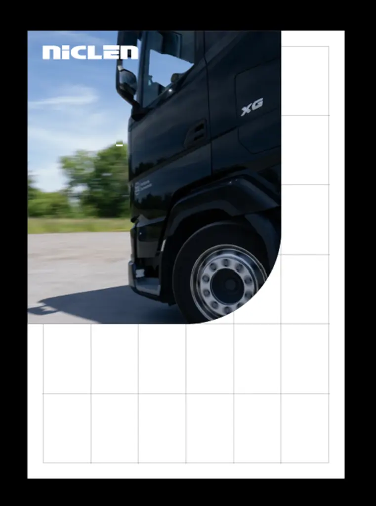
Example in DIN format

Please don’t do that
× The cyan wordmark blends into the blue sky of the background image.
